9 Jul 2012

2 pieces of atrocious copy that were published

Exhibit 1: a Wimbledon promotion for Jacob's Creek, in the Metro newspaper (click for full size)...


"Has partnered with... to bring alive the brand's philosophy"??? Did they just copy this directly from the Account Manager's email? Did the writer know they would be talking to ordinary humans?

Exhibit 2: Taiwan Excellence...


With the best will in the world, I can hardly take seriously an advert that suggests Taiwan is the only country using innovation in product design, R&D, quality and marketing. What IS unique is their description of this as "innovalue". Perhaps that's what they were trying to say.

5 Jul 2012

Powerful athletes' quivering muscles

Yes, it's the Olympics, and nakedly sexual admiration for the scantily-clad, fat-free, streamlined human body is going to be the nation's top hobby for a month or so. With that in mind, here is the BBC's trail by RKCR/Y&R.

Go fullscreen and HD for full effect:


I mention quivering muscles for a reason - it's actually just one beautiful piece of attention to detail (look at the gymnast on the rings at 0:34) in an animation full of them. A crew of dozens put this together, and no wonder - even though the characters are distorted, it's still one of the finest artificial representations of human movement I've ever seen.

Does it mean much? Not really, apart from a vague aspiration to include the entire country and not just the capital in the Games. It's mostly just an appetite-whetter for an event we know about already. But as a piece of craft, it's hard to beat.

Oh, and it is, of course, nothing like the RKCR ads for Lloyds TSB, whatever the occasional fuckwitted organisation with a vendetta against the BBC might have you believe...

3 Jul 2012

Go (fuck yourself) Compare

I've made a habit on this blog of mentioning projects that my friends mention on social media. And this one is especially satisfying as so many were taken in by it. I'm talking, of course, of Dare's "graffitied" Go Compare billboards that have been appearing round the place.

Here's one friend who was taken in even though he studies advertising...


...and another one who fell for it on Facebook.


As luck would have it, Dare CD Laura Jordan-Bambach was in the School mentoring yesterday and gave us some useful insight into the lengths they went to in order to hoodwink people.

Firstly, they made sure that only one poster in a certain area would appear to be vandalised, to increase the likelihood of someone seeing an unspoiled one. Secondly, they printed the "graffiti" parts at a much higher resolution than the rest of the poster, to make it look more realistic.

It's a useful little lesson into craft and attention to detail - if the campaign hadn't fooled anyone it could have backfired badly.

1 Jul 2012

D&AD Student Pencils / Placement

I've been neglecting this blog a great deal lately, but with good reason. I've had a very busy couple of weeks, on placement at AMV BBDO. More of that later, but big news first.

Olly and I won a D&AD student award for our "EA Peace Day" idea in the Open Brief category. And then we won the award for D&AD Students Of The Year! Here we are with 50% of our awards...


Needless to say we're over the moon, but of course it's as much about the opportunities it opens up as the actual awards. So we're very much hoping to get placements as good as the one we just had, because AMV's system should really be the benchmark.

First of all, they have a system in place - you're looked after by someone outside the Creative department, which actually works wonders. This means that you're not constantly hassling busy creatives for briefs or help - instead, you're making phone calls to Account Managers, Planners, Project Managers - all of whom are invariably happy to help.

There are the little things, too, like the fact that they create an email address for you, and put you on the agency-wide and creative mailing groups. This means that from day one, you actually get emails - and even if they're just telling you that some left an iPhone in the 3rd floor ladies', they still make you feel part of the organisation.

Oh, and they pay placement teams, and there's free porridge before 9am. What more could you want?

12 Jun 2012

What The Shitting Fuck #6 - Kia Euro 2012 sponsorship

Who the fuck are these people?
Why have they been invited to play at a national football match?

If by some weird chance they are a famous enough band to play at a major event, why are they travelling in a small, cheap car?
Why are they bringing along the instruments with them in a car, rather having them safely transported with the rest of the equipment in professional flight cases?
Why, if they're playing a massive gig at a football stadium, do they need to practice the song on the way there, and get it wrong to boot? Why aren't they better prepared?
When they're singing in the car, whose is the second female voice harmonising with the girl in front? If it's one of the men singing falsetto, why are none of them moving their lips?
Why are they playing a cover instead of one of their own songs?
What has playing a song about being secretly gay or bisexual got to do with small cars or major football events?
Why do they need to drive the car onto the pitch?

I'm sure there's a reasonable explanation for it all.


10 Jun 2012

A Sunday Afternoon (more photos)

Just like yesterday, I was on a quest to ward off boredom, so set off out again. First up, some place near Borough was having an open gardens day so I met up with some friends, taking in a statue of King Alfred and a nice spiky flower:


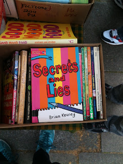
There was also a book stall. I assume this isn't the book on which Mike Leigh's film was based.


And then to the London Transport Museum. Almost too much to blog about - possibly the most lingering memory will be a weirdly unsettling incident where a little girl asked me to help her find her Mother. Which sounds fairly normal, but she was literally dragging me by the hand to get me to take her to another bit of the museum. In the end I found a member of staff to take care of it, but it was very very odd.

Anyway, the highlights included a nice reminder that some things never change, some old school copywriting, and one of the best bits of art direction / illustration I've seen in a while:


And lastly, the chap at the desk said they didn't have any free maps of the place - I either had to buy one or take one of those they give kids as a challenge to keep them occupied.

Well, I've never been one to turn down a challenge.


9 Jun 2012

A Saturday Afternoon.


Mrs Cutcopywrite is away at a festival this weekend so I decided not to mope around the flat for 2 days, and headed off to the Imperial War Museum.


Before I got there, I was wandering past a dance school, and noticed there was a free art exhibition on. So I looked at it, my attempts to understand it soundtracked by muffled thumping from the rehearsal rooms above.

I liked this one, entitled "Film Poster" (click to see full size and read it):


When I got into the IWM, there was a young toddler screaming. Later on, I was looking at a display on the Blitz and it was still screaming. At first it was annoying, but then it occurred to me that it was perhaps displaying the most appropriate response to the horrors and stories on display. More appropriate, certainly, than the 3 young men wandering through the Holocaust Exhibit, chatting about their favourite comedy programmes.

Having suffered the Holocaust, as it were, I decided to give the Crime Against Humanity film a miss, though I was intrigued by the warning at the entrance:


I'd like to think the disturbances are caused by distress, but I suspect that most are protests from those with a pathological blindness to the atrocities committed by their state of origin. Of course, it's the same mental myopia that means we have Holocaust Exhibitions in the first place.

And if that seems a sobering thought to end on, then fear not - I'm just about to watch some football, make a rich carbonara, and start on my second Corona.