I'm an occasional freelance copywriter, but mostly a student at the School of Communication Arts in London. Previously an Account Manager at a small design agency, where I started writing copy and thinking up headlines and slogans. In fact, I've been writing all my life, but it never occurred to me I could make a living from it this way. So now I'm giving it a go.
I was reading Alan Bennett's "Untold Stories" at bedtime last night and came across an entry from his diaries I'd forgotten about. Rather improbably, it features the great writer praising a TV commercial, for Carte D'Or ice cream. Here he is to explain:
And here is the advert itself:
I think the description is actually slightly better than the ad itself - I think the timing could have been tighter. But it's marvelously observed nonetheless.
We had an intensely thought-provoking masterclass at SCA on creative briefs from Patrick Collister of Creative Matters. Too much to distill and discus here, but one message that stuck out was that there was a clear difference between "idea" (or "meaning") and "execution".
The example he gave was the Carlton Draught's "It's A Big Ad" TV slot. The idea is to take the piss out of advertising. The execution is to parody the "big event" adverts with giant overhead shots of huge crowds.
But it's not a simple concept, so I felt the need to apply it to other adverts to see if I can make it work myself. Here goes...
Carlsberg bikers in cinema
Meaning: Carlsberg is a reward
Execution: Film people being given Carlsberg for a brave or difficult task
T-Mobile flash mob
Meaning: Show people sharing fun together
Execution: Take a spontaneous YouTube phenomenon and recreate it with paid extras
(you may be getting the idea that I'm not overly keen on current T-mobile ads, if you've been paying attention to this blog)
Weetabix dancing teddies
Meaning: Weetabix gives you amazing energy
Execution: Show girl eating it and dancing in groovy/odd way with groovy/odd teddies
Yeo Valley rapping farmers
This HAS to be the odd one out. I'm sorry, but even if the Creative Director was in front of me now denying it, I would not deviate from my belief that the very first thing they thought of was the "Yeo Valley" / "Yo Valley" pun, and the idea grew from there. I refuse to believe the first insight was "wouldn't rapping farmers be amusing?". Note that the tagline is so utterly unmemorable (not sure? it's "live in harmony") because it doesn't have to be - the execution does all the work.
An appropriate post, I think, as we popped into BBH London last week as part of our agency visits. Bit of a pilgrimage for me, as John Hegarty's book was one of the things that convinced me I was taking the right path. Anyway, here is their new "aviators" ad for British Airways.
There you go. It's obviously stirring, tells a story, beautifully shot and written - it's the kind of ad that BBH do best. But I think the most interesting thing is Easyjet's response.
It's easy (hah!) to see this as a shot across the bows, and it is certainly a little cheeky. But I suspect that it won't bother BA one bit. Anyone who is looking to save probably already knows that Ryanair and Easyjet will be cheaper. If anything it reinforces the message that for heritage and quality, you go to British Airways. Both brands stay in their respective places, and although Easyjet may get publicity out of it, I don't think it's at the expense of the older airline to any great degree.
You could compare it to the Dixons ads targeting John Lewis, but BA's advantage is in having only one position to defend, which Easyjet don't even try to attach. John Lewis made the mistake of saying "never knowingly undersold" on 3 things - quality, price, and service - meaning they have to fight wars on 3 fronts.
Here is the latest effort from Saatchi and Saatchi.
Sorry, but I don't like this one bit. What is it saying? They're not even offering cashback, they're just illustrating some vague idea about surprises. There's no real connection between product and concept.
Not to mention the fact it plays up to the tabloid assumption that generosity is the reverse of what traffic wardens do and how they behave. What traffic wardens do is enforce the law, and for the majority of the time they behave perfectly reasonable.
Perhaps next they could have social workers threatening to take kids away from their families, then reveal they've won a holiday? Perhaps gypsies could park a car on someone's drive then reveal they've won a car?
The problem is that the advert thinks it's challenging assumptions, when actually all it does is reinforce them. I don't care if it works. No-one should be proud of this ad.
Though "Boom! Welcome to Brighton" is a good line, to be fair.
Just a quick thought about how we can use copywriting tricks and techniques without thinking about it. I was reading this excellent guide, and in particular the section on parallelism. It describes it as "the deliberate repetition of a particular word, phrasing or sentence structure for effect". So, for a really simple example, "Don't just do it, B&Q it".
Then I was listening to a copy of the new album by Brit pop-punkers You Me At Six, and a rather emo breakup anthem called "This Is The First Thing". The chorus goes...
This is the first thing I thought This is the last thing that I want You were the first one I loved You were the first love I lost
Really simple, but with different words, it wouldn't be half as catchy. Perhaps singer Josh Franchesci has an alternative career ahead of him.
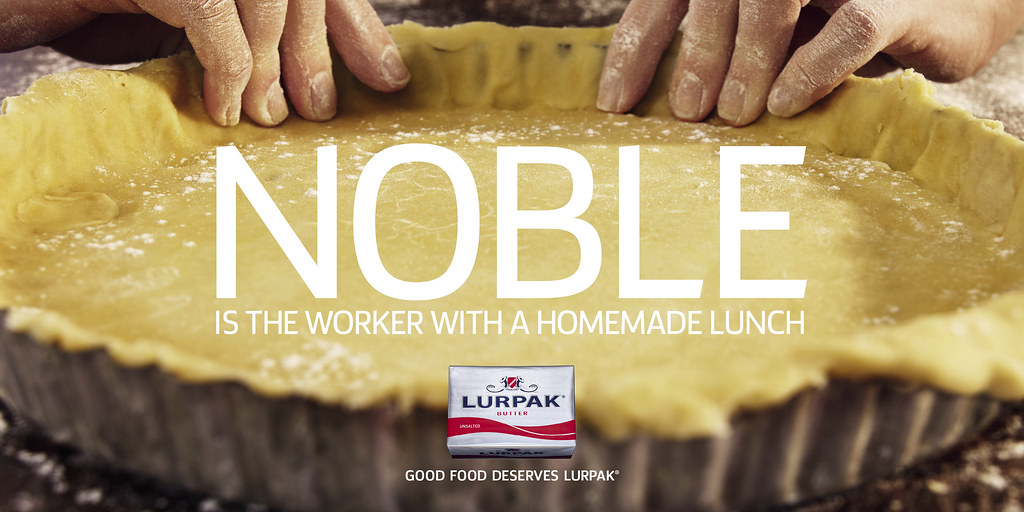
Seen on Camberwell New Road on my walk home from class.
The main thing that needs to be praised is the art direction - it's a beautiful image. It makes me hungry. I urge you to take a look at the full size image.
I wasn't so sure about the headline "noble", but in context with the rest of the campaign, which is headed with words like "salvation", "heroics", and "empires", they deserve their space.
The stated aim is to "reinforce the brand’s position as the natural choice to enhance good food", and in a marketplace where there is no discernible quality or price difference, it's as good a way as I can think of to swing your decision. It is, let's face it, an appeal to the middle class foodie, the people who want simple homemade food with good quality ingredients, and are sceptical of packaged sandwiches and fast food. Yes, it's preaching to the converted, but it's beautifully done.
I met a student from last year's intake at SCA briefly today. He had an American-ish accent and I asked where he was from. He said "Bermuda" and for some reason that threw me a little, and the conversation came to a fairly abrupt halt. I felt slightly uncomfortable about it afterwards.
Then as I was brushing my teeth, paying attention to the gums, it suddenly occurred to me what had been so disconcerting. It was that I automatically think of Bermuda as a place that people go to. It's never, never, ever a place that people come from.
It turns out there was another possible reason I found the scene so affecting, which came up during an improv workshop with Stella Duffy. The group had to stand in the circle, say their name, and a fact about themselves (and later, a lie). The point that came out of it was that the facts we remembered were the ones that had "specificity", i.e. the ones that provided an interesting nugget of information to hold on to.
So everyone remembered that Jaane had eaten hamburgers all week, or that Olesia like white clothes with red detail, or that the man I saw earlier that morning was Peruvian. So perhaps that's why I still remember the chunky kit kat line from Queer As Folk, even now.
...or so we're told. Sometimes, they might just work in an advert. And so here are the Vodafone freebees.
I actually love the concept, I just hate the art direction. Maybe it's just a personal thing, but those hyperreal illustrations and animations (see also British Gas) just creep me the hell out. I'm sure a simpler illustrative style would be more emotionally appealing.
Advertising is all storytelling. We know this. John Hegarty has a whole chapter about it. And one of his most important points is to say "you must leave room for the audience to participate", whereas "most writers leave nothing for the audience to do".
These words came back to me as I bought a Chunky Kit Kat on Argyll Street. There was a scene from the second series of Queer As Folk (the original UK version), where the flamboyant, extrovert Alexander had visited his dying father, to learn that he would be denied any inheritance - because of his sexuality. His response was brittle, uncaring, and defiant, but later on, as the characters prepare for a party, an ambulance turns up outside the house and Alexander goes to answer the door
Paramedic: Right, somebody call an ambulance?
Alexander: It's me, I'm fine, I've got the bottle (hands over medicine bottle), there you go, I only took them ten minutes ago so there's nothing to fuss about. Um... I had a Chunky Kit Kat, but I don't suppose that counts.
Paramedic: Well let's get you seen to, are you walking alright?
Alexander: Yeah I'm fine, it's nothing, let's go.
There you have it. Without ever explicitly stating it, you know that this is far from Alexander's first suicide attempt or overdose - he anticipates the questions before they come; he knows the drill. And you know how I'm sure it works? I saw this programme once or twice, and probably about 10 years ago. And yet I still remember the exact brand of confectionary that Alexander had eaten after he'd swallowed all those pills.
I started seeing these posters for the Paralympics yesterday on the tube. Apparently they're by McCann Worldgroup, and they're certainly striking - they command attention far more than most other posters currently up there. I'm a little dubious about the copywriting on this one, because strictly speaking he doesn't just use his arms. The wheels help.
This one is a whole lot better, and a really good example of research driving the copy. You push your client for all the information they can offer, then pick out what's interesting. In fact it's so strong that they should have have used this powerful theme - the minute difference between success and failure - across the whole campaign.
I also like this one because it doesn't explicitly reference the disability - it just shows it in the image. I think people are used to the idea that Paralympic achievement is against all odds, and just want to treat it as any other sport. Having said that, I assume someone at the Paralympic Association signed it off so if they don't mind, I suppose it's hardly something to make a fuss about.
Saw a little item on the Campaign website which tickled me. You might need a subscription, but the gist is, Carlsberg are launching a new campaign with the strapline "that calls for a Carlsberg". Incidentally, I think it's pretty good, it's clear and concise and alliterative and has a nice rhythm, although I'll wait to see the actual ads before reserving judgement.
Anyway, the part that made me raise an eyebrow was the quote from Carlsberg's "brand controller", who says "the partnership with Sky Sports is the perfect vehicle to communicate with our target audience and reinforce our new 'That calls for a Carlsberg' line. For this campaign, we’ll see the Carlsberg brand positioned as the perfect every day reward."
Now what I suspect he meant was "the perfect everyday reward", suggesting that it is unpretentious, low-priced, and to be enjoyed on a regular basis. However "every day" means just that - he's suggesting that people should drink beer every single day of the week.
Morrissey knew the difference, that's why it's "Everyday Is Like Sunday" and not "Every Day Is Like Sunday"; there's a sly joke in there at the people who label him as a misery-guts.
postscript: I just looked at the thesaurus entry for "everyday", and the synonyms include "chronic" and "habitual". Perhaps either way, it's a phrase best avoided for Brand Controllers selling alcohol.
OK, so the first in a series of occasional posts for ads that are just so bad as to be downright inexplicable.
Throughout the first half of England's 1-0 victory over Wales at Wembley, there was some kind of holographic image of a car parked behind the goalline. Then, during half time, this advert was shown:
OK, so it's a concept driven by the medium. Fair enough. But 2 problems:
Firstly, throughout the whole first half, I had barely noticed that there was a car there. So much crap gets projected onto screens, and hoardings are so interactive, that it just didn't register with me. Weirdly, if it had looked like a real car, I might have thought "that's parked a bit close to the touchline". But because it was obviously a bit of camera trickery, my mind's natural adblocker just filtered it out, so when the half time ad came on it made no sense.
Secondly, watch the ad again. If anyone can spot a single clever or witty line in it they must be looking very very hard. Why do they say "is that a steward on the pitch" when it's clearly a man in fancy dress? Even if the hypothetical commentators had thought it was a steward, why would they have mentioned it in such a surprised excitable tone? And if it's supposed to be quasi-real (which is why it says "advertisement"), why isn't he chased by stewards and instead left alone to do what he likes on the pitch?
It may seem like I'm taking the concept too seriously, but the point is, someone has to, or else these little flaws all work together as obstacles to the viewer's enjoyment. And in the script, nothing is relevant, nothing drives the advert forward or creates a story. I'm not sure how the advert is supposed to make me think or feel.
Attention to detail is paramount. But here, it's like the media guys had the idea and left the writing to the special effects guy.
Following last week's chat about positioning in the rail industry, and the fight between Virgin, London Midland, and Chiltern over the Birmingham-London route, I got this email in my inbox.
It's pretty much exactly what they should be doing. It plays to their strengths - the new trains and the faster journey time, the pictures immediately convey an image of speedy, professional, comfortable travel. Note that it doesn't actually say anything about how the improvements were made - it's all about the journey, about the passenger experience, not about the type of track, or how much the project cost, or the technological advances. Leave that to the trade press. All the customer cares about is: it's quicker, and it's a more pleasant trip.
Now compare London Midland (from their website), who are introducing new trains on the Snow Hill lines. You have to get halfway through the 4th sentence before finding out what this actually means for passengers. I mean, really, who gives a toss about "resignalling", or that the trains are built in the Midlands? Not to mention that admitting to replacing a 25 year old fleet sounds a lot like "better late than never". And as for the photo they lead with - what does that tell you? It looks pretty much the same as any other train to me.