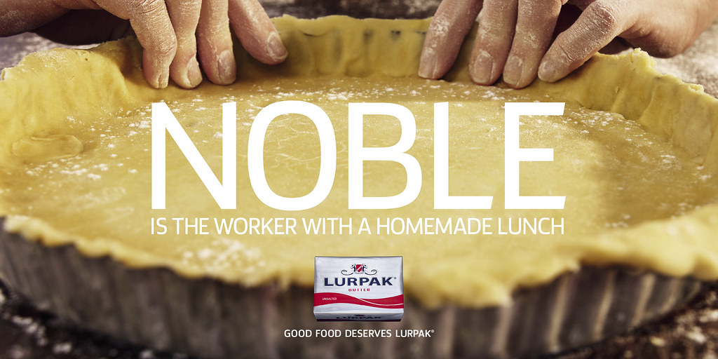
Seen on Camberwell New Road on my walk home from class.
The main thing that needs to be praised is the art direction - it's a beautiful image. It makes me hungry. I urge you to take a look at the full size image.
I wasn't so sure about the headline "noble", but in context with the rest of the campaign, which is headed with words like "salvation", "heroics", and "empires", they deserve their space.
The stated aim is to "reinforce the brand’s position as the natural choice to enhance good food", and in a marketplace where there is no discernible quality or price difference, it's as good a way as I can think of to swing your decision. It is, let's face it, an appeal to the middle class foodie, the people who want simple homemade food with good quality ingredients, and are sceptical of packaged sandwiches and fast food. Yes, it's preaching to the converted, but it's beautifully done.

No comments:
Post a Comment